Color Matching Paint In GIMP: Don't Make These Mistakes

Please note: This post is a stream-of-conciousness journal entry that describes all of the mistakes I made while trying to color match paint. This is not a how-to guide from an expert.
We're renting an old house that needs a lot of maintenance. The landlords are very easy-going so we're allowed to have a dog and two cats. They also said we can pretty much do whatever we want to the house, so we've installed lots of home automation stuff, put up a garden shed, and hammered nails into the walls to put up pictures. We also take of the lawns and the garden and help to keep the place tidy.
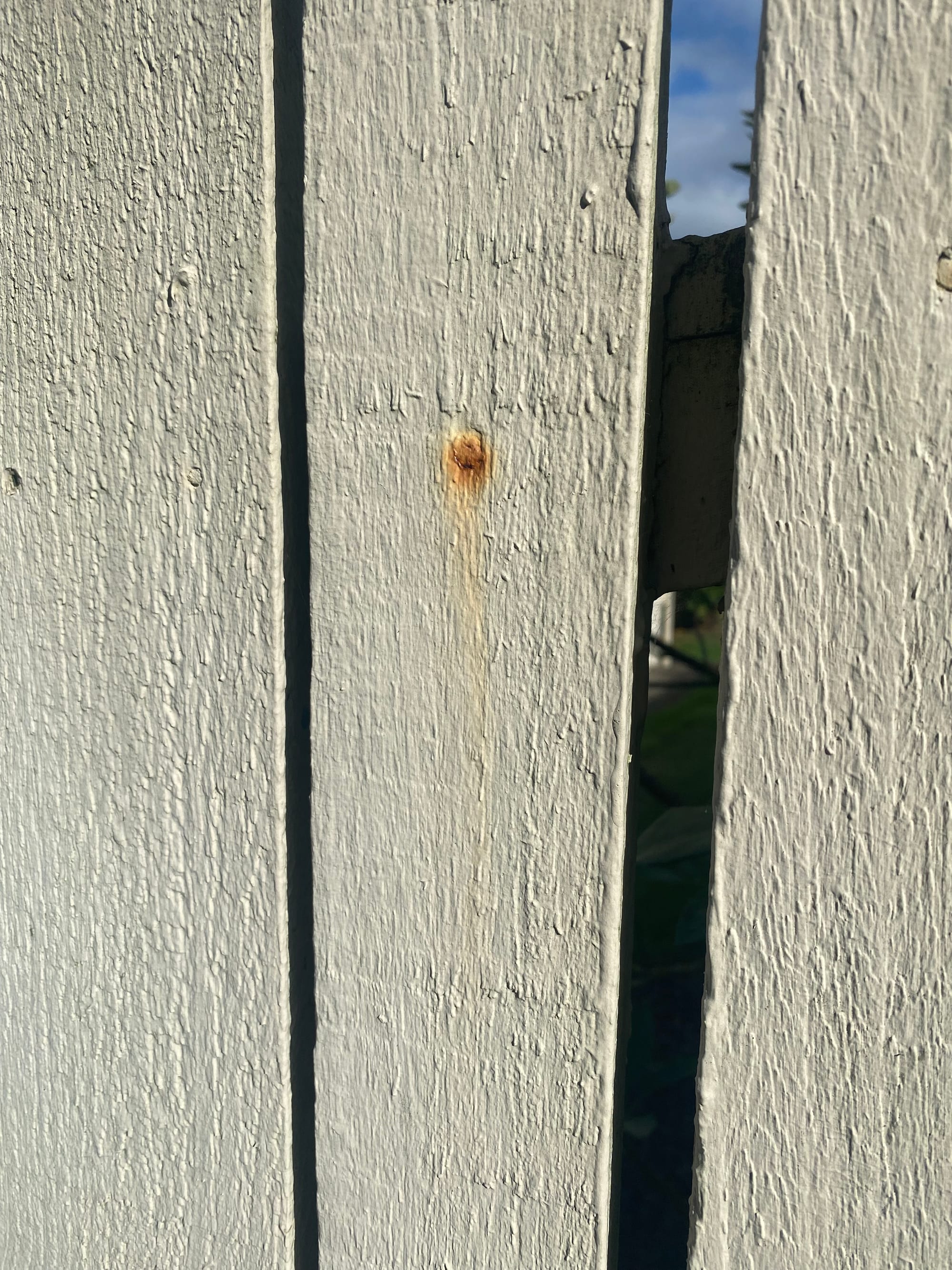
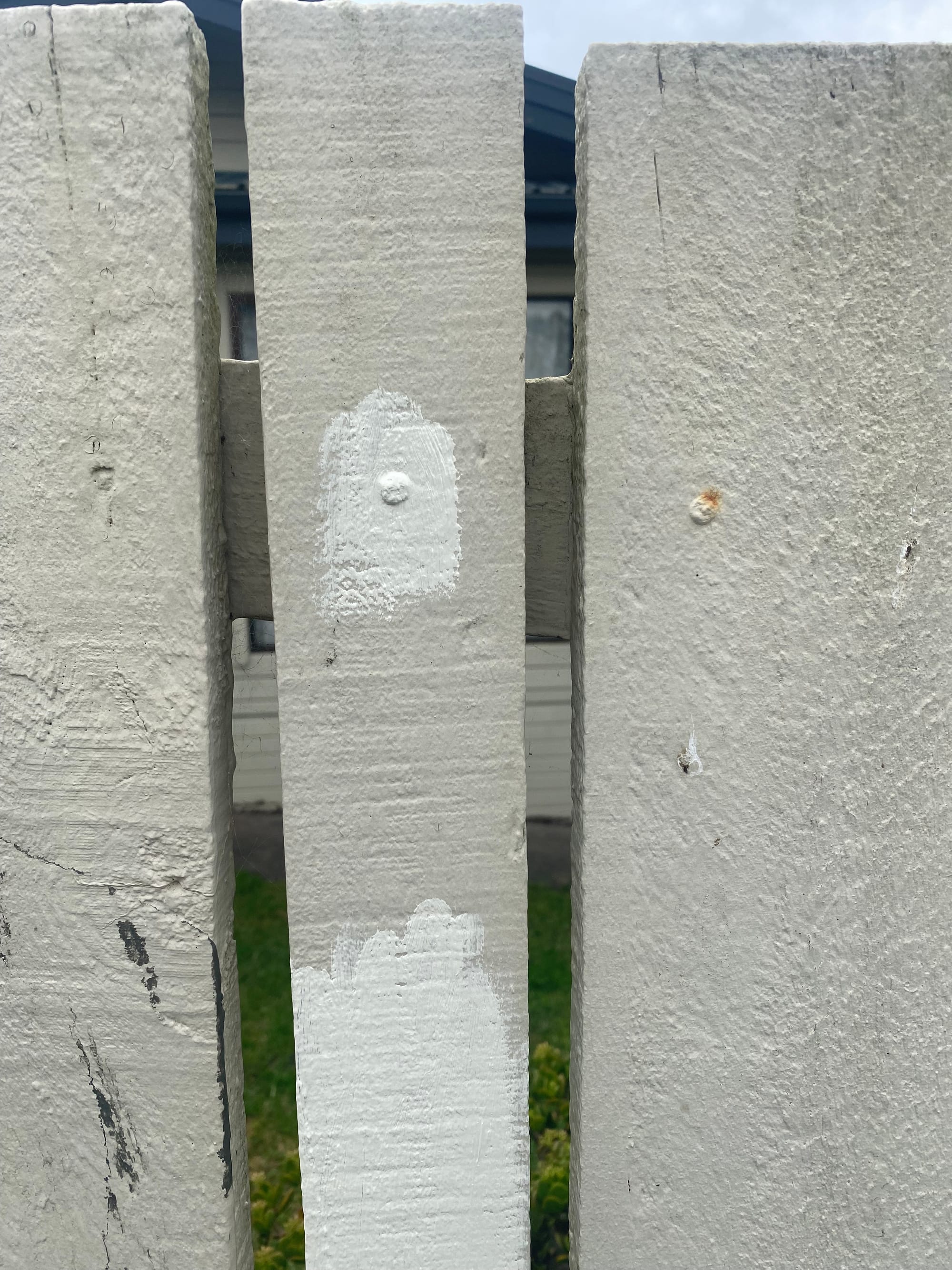
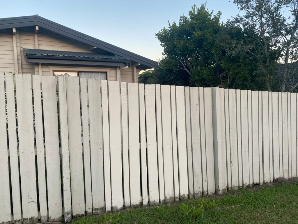
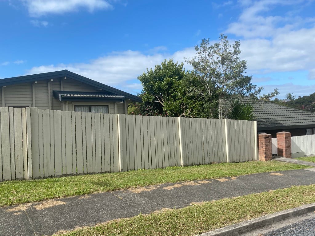
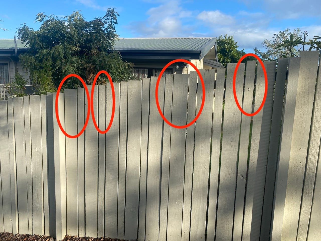
"Tidy up the fence" had been on my todo list for a long time. There's a few marks and rusty nails, and it looks like someone had tried to paint a... smiley face?
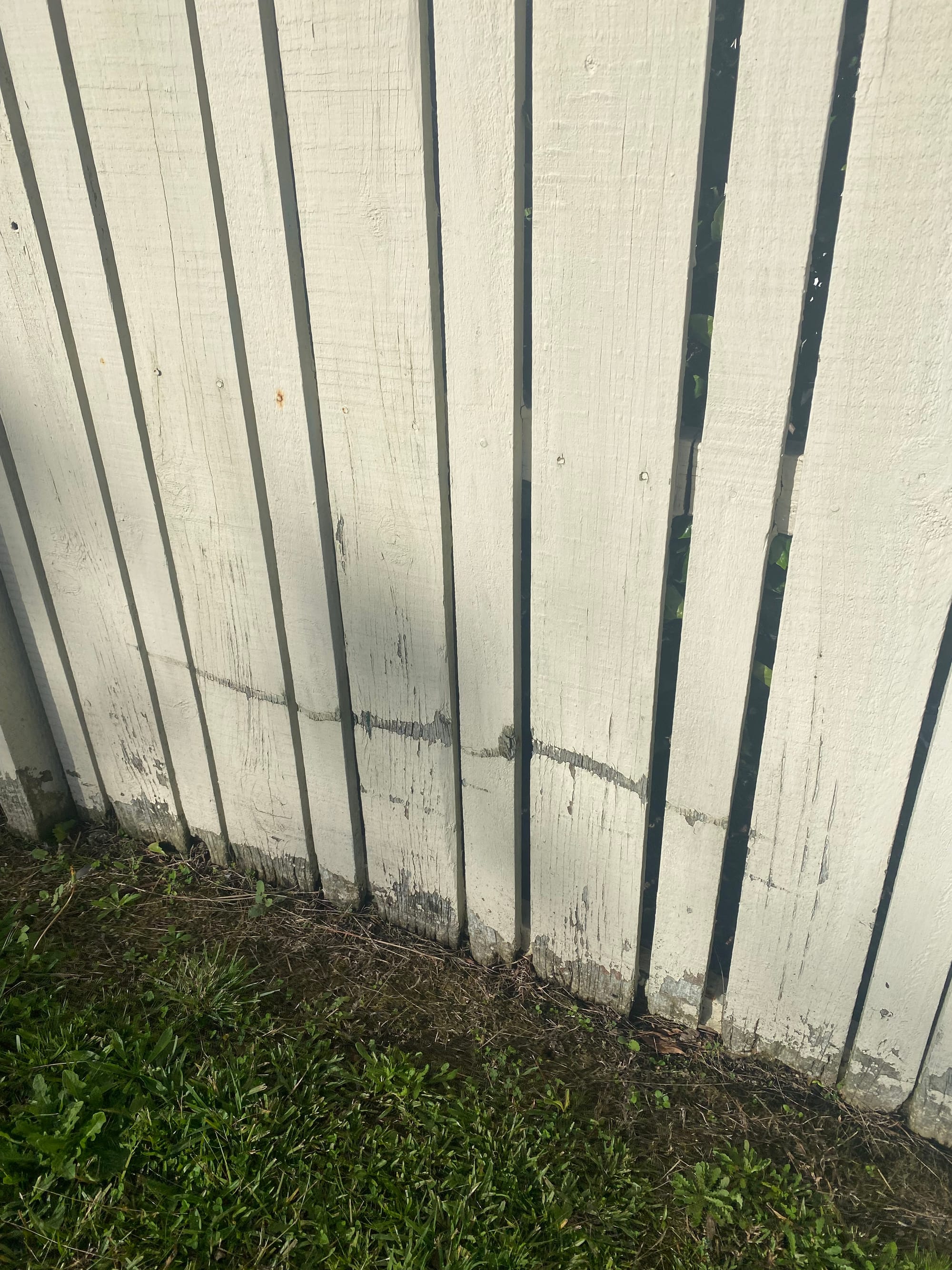
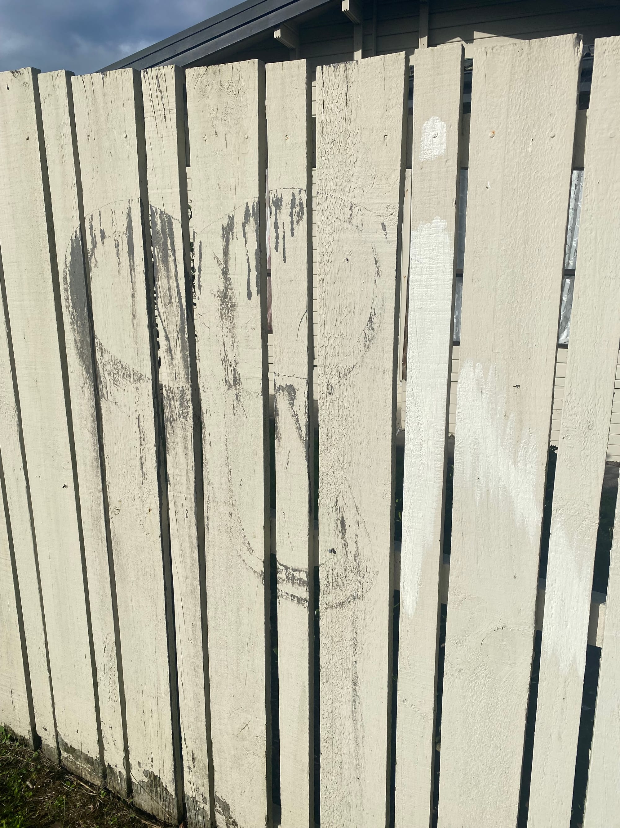
I think they forgot the mouth on the smiley face.
I thought it would be nice to touch up the fence with a bit of paint. I guess the proper way to do it is to pressure wash the fence, sand it down, apply a coat of primer, then a coat of paint. I didn't want to do all of that since the fence is old and probably due to be replaced. I just wanted to paint over a few spots, so I needed to find a matching paint color.
I tried taking a small bit of painted wood to the hardware store. They have a computerized paint machine that can scan a color and mix some paint to match the color. Unfortunately this didn't work too well and the resulting paint was too dark. They said that my painted wood chip had a bit too much dirt and grime and it wasn't easy to clean it, so they couldn't get an accurate color.
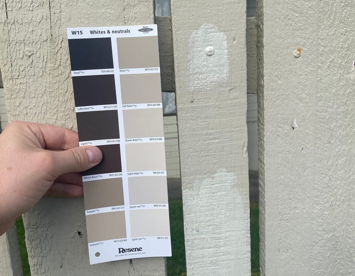
I went over to the Resene color swatches and held up my paint flake. "Double Thorndon Cream" seemed like it was a good match, so I bought a small test pot. I also brought home a collection of 28 Resene color cards for white and neutral colors, just in case I needed a different color. (They were free!)
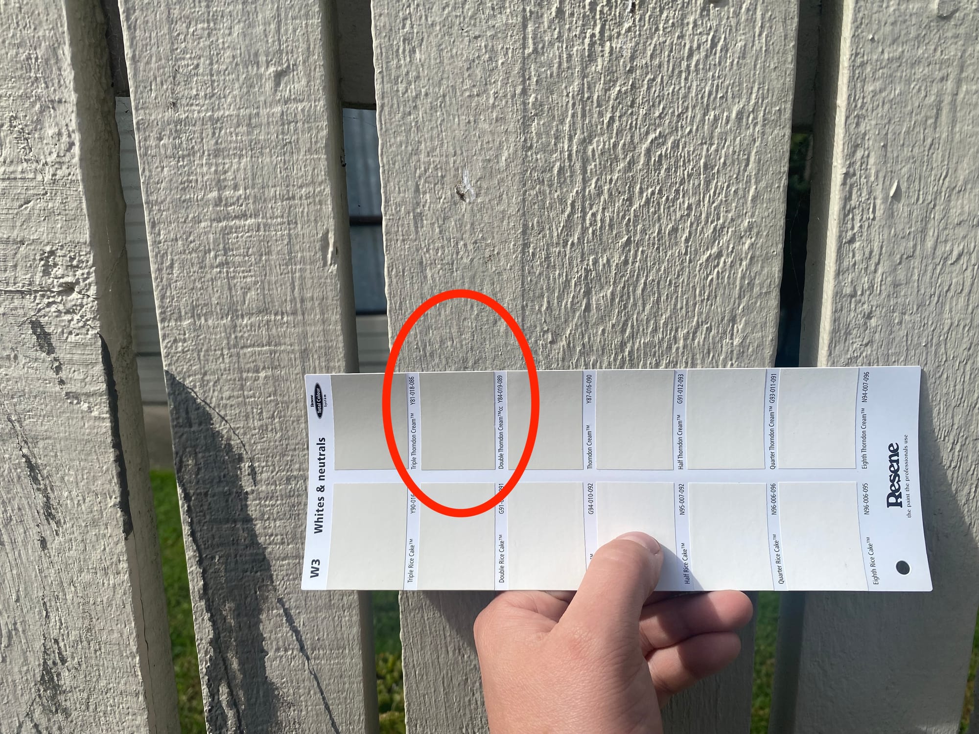
I held up the color swatches and double-checked that "Double Thorndon Cream" matched the fence. It seemed pretty close, so I tried it out.
Wait, what? Why is it so light? Maybe there's something wrong with the paint in the test pot. Even if it's a bit brighter when it's wet, I can't see how it will be the right color when it dries.
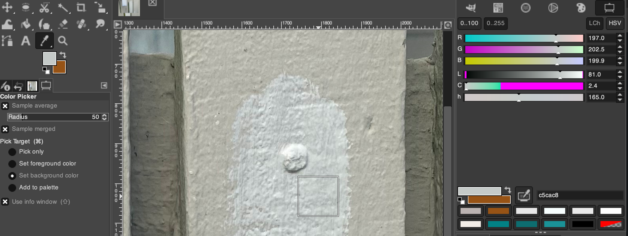
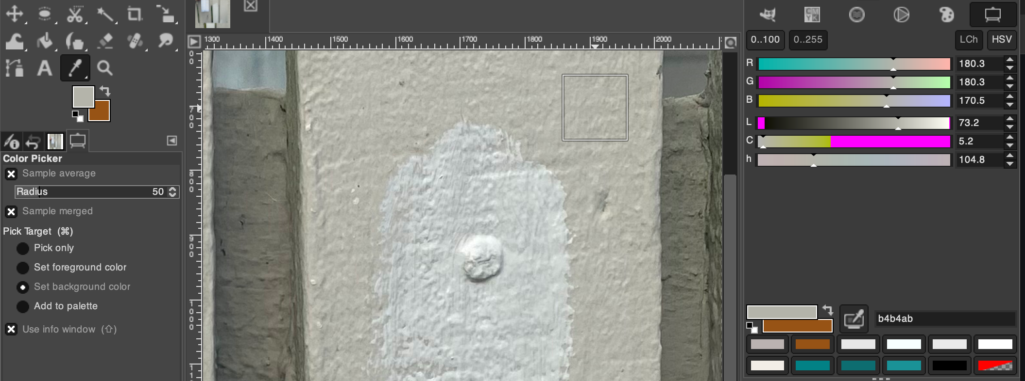
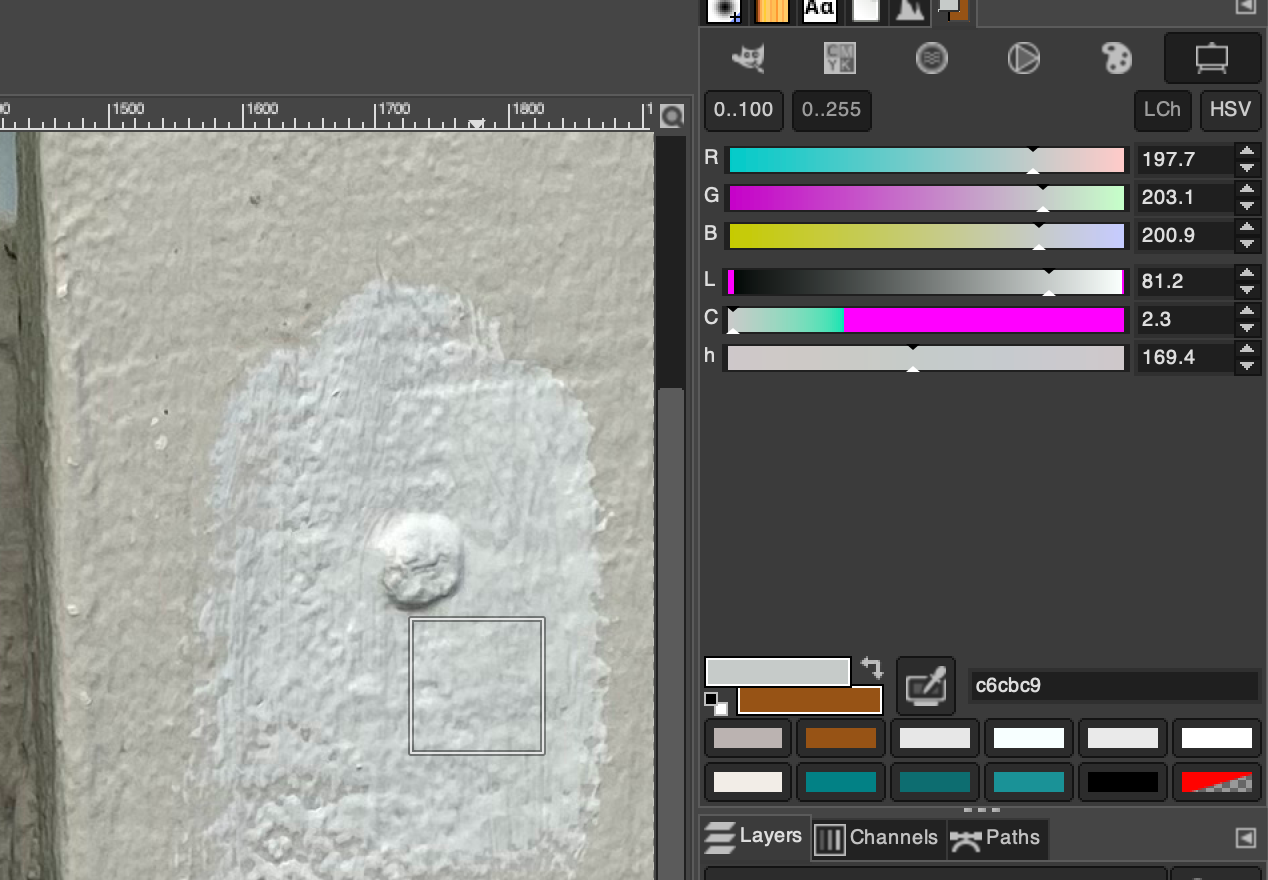
I took a picture and used the color picker tool in GIMP. I wasn't able to choose a single pixel since the wood has a lot of texture, so I checked the "Sample average" option and took the average color from a 50x50 square.
I also checked the color of the original paint:
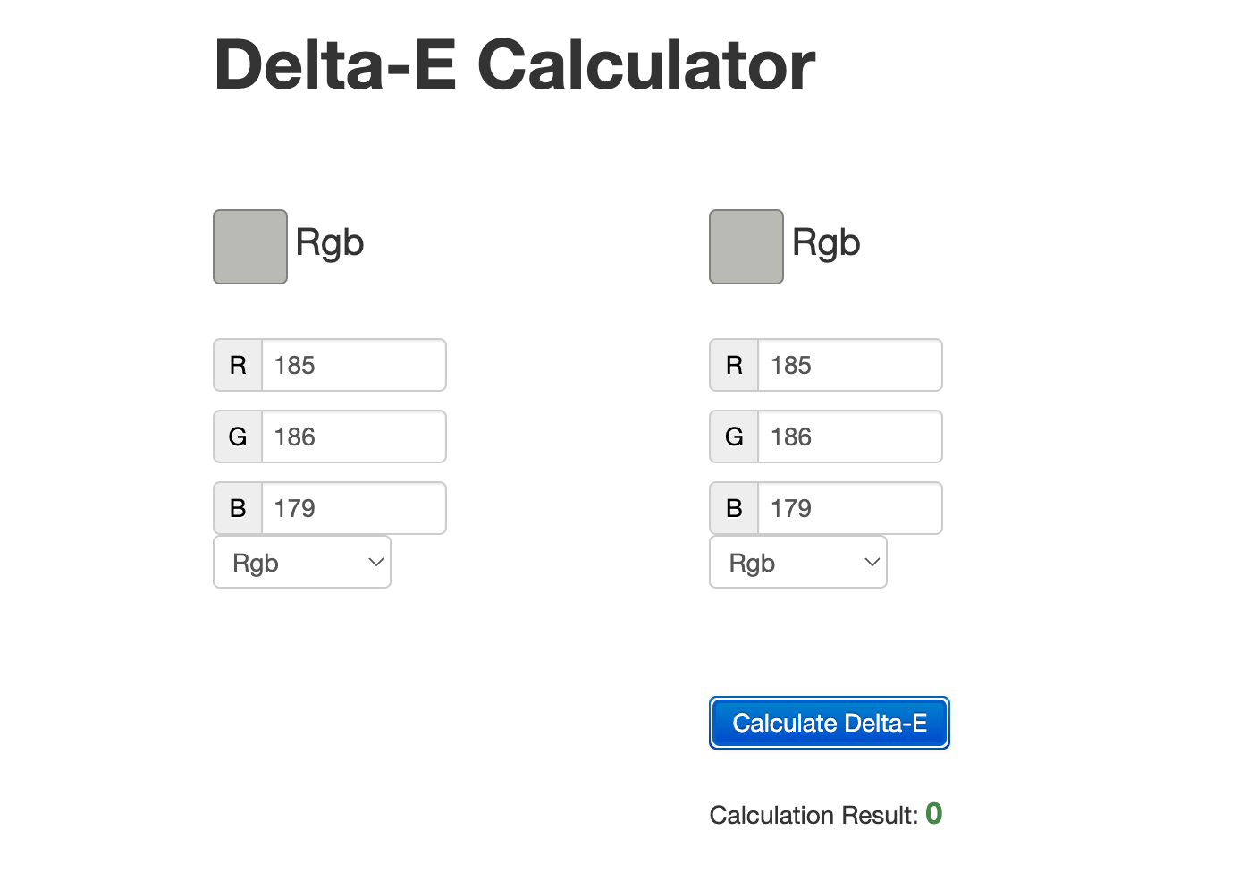
I did some Googling and found an online "Delta-E calculator":
This tool can calculate the "perceptual distance" between two colors by using the Cie76 algorithm.
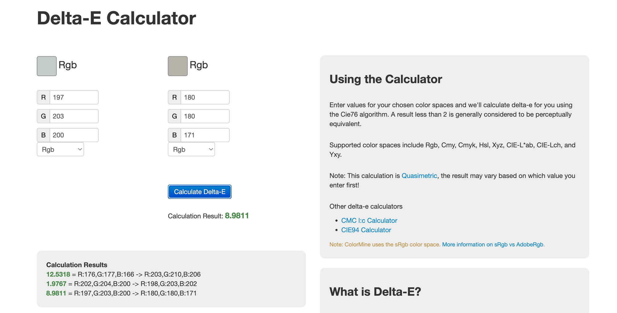
The difference between the original paint and the paint from my test pot is: 8.9811. Apparently that's quite a big difference. Humans can't tell the difference between colors if the difference is less than 1. That might be too hard to find, so I decided to aim for a difference of less than 2.
But how did I get it so wrong? Maybe I didn't mix the paint in the test pot well enough, or maybe it was a lot lighter than the swatch. So I checked the colors in GIMP.
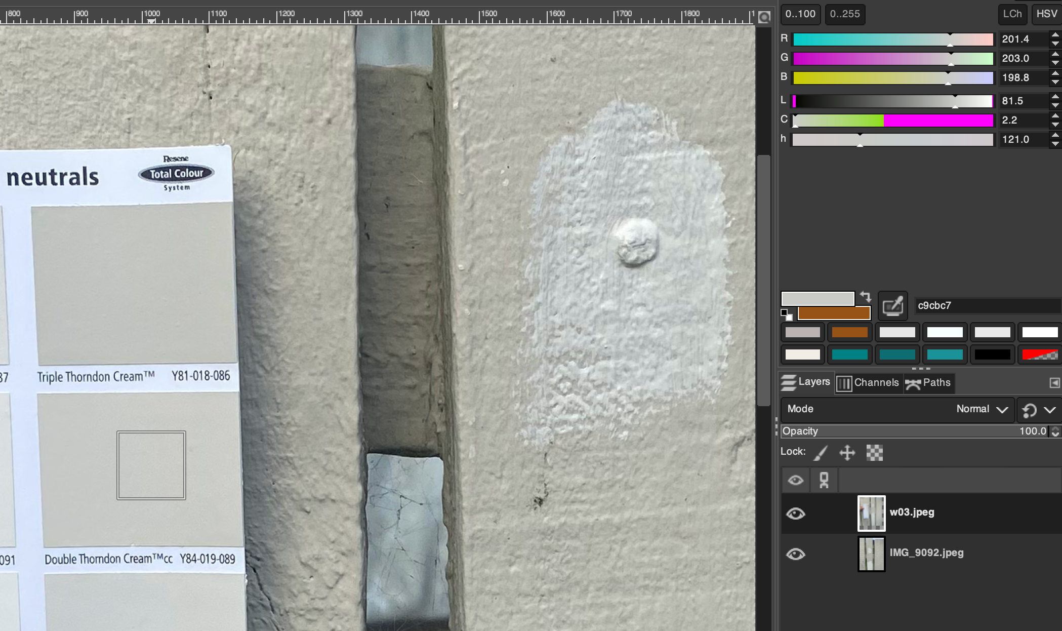
- Swatch =
rgb(201, 203, 199) - Paint =
rgb(198, 203, 201)
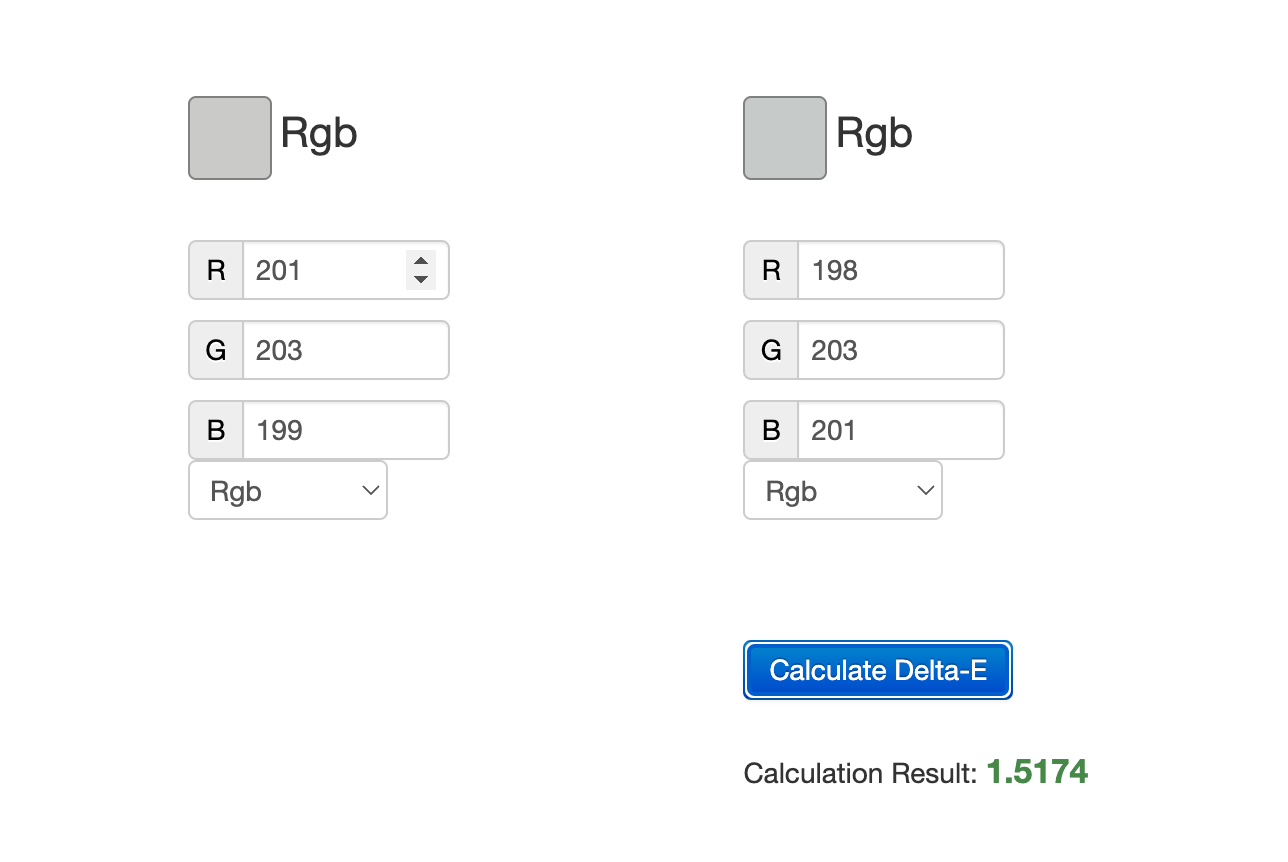
The Delta-E difference between these two colors is only 1.5174. They're actually very similar colors.
So the paint does match the swatch. Maybe I shouldn't be relying on my eyes so much.
 Contributors to Wikimedia projects
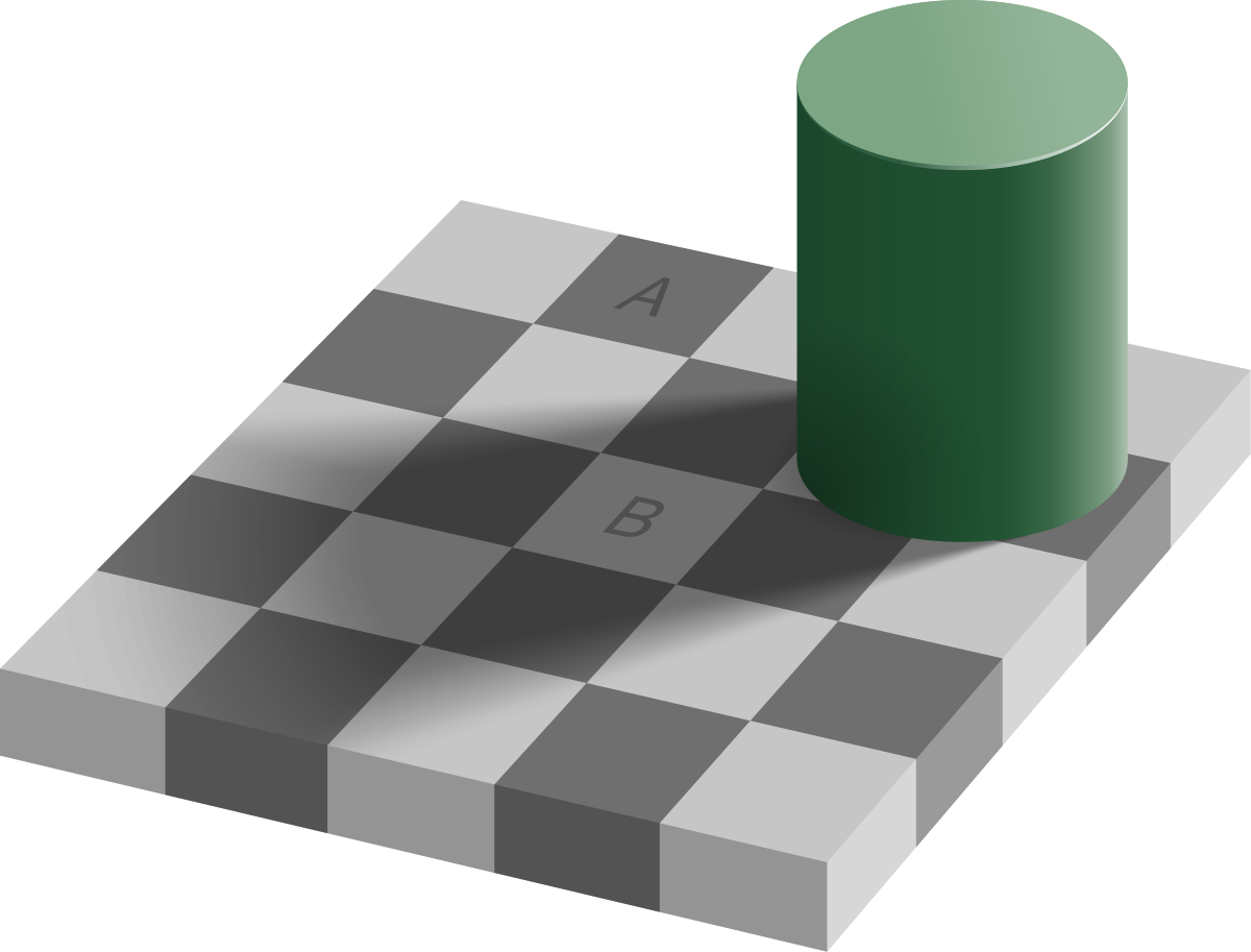
Anyway, now I know that the color swatch cards can be trusted. If the test paint matches it's corresponding swatch, then maybe I just need to find a swatch that matches the original paint. But I'm not going to rely on my eyes this time. I'm going to use the color picker and look at the Delta-E differences.
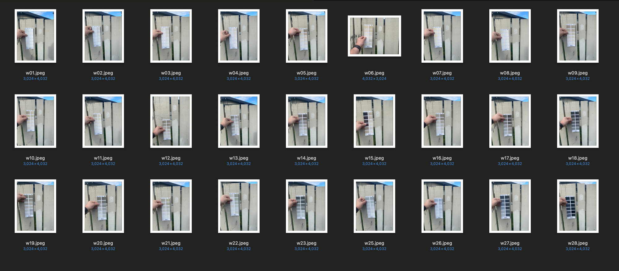
I took photos of all 28 swatches against the fence and went through all the colors one-by-one.
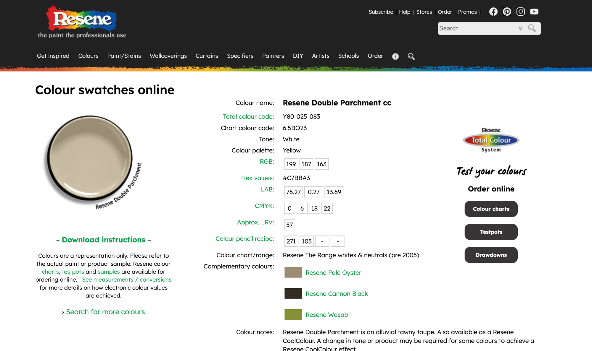
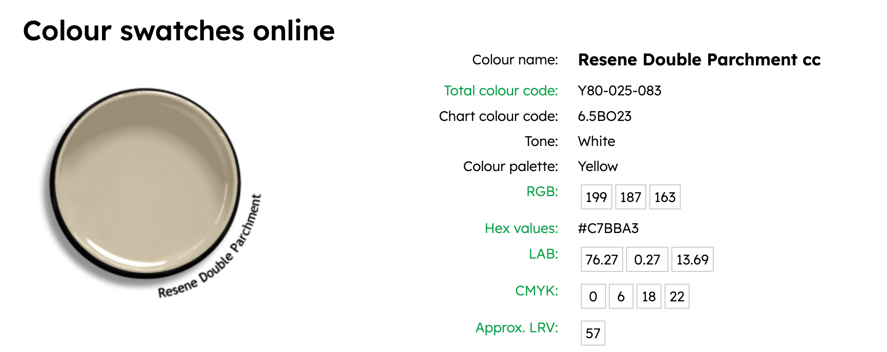
Resene Double Parchment™️cc - Y80-025-083
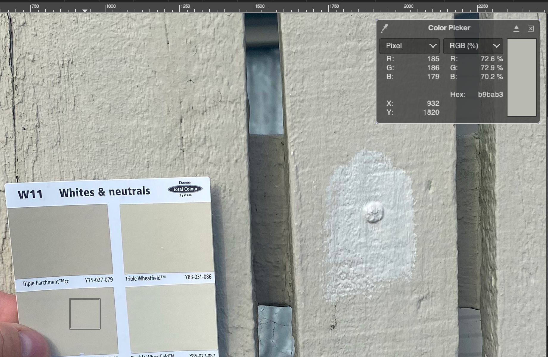
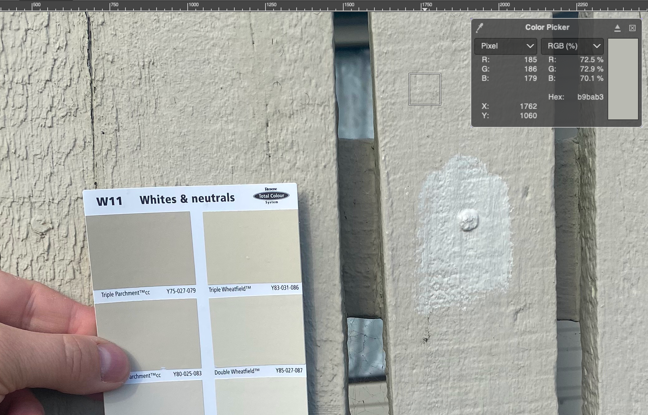
I found a color called "Double Parchment" that perfectly matched the paint. It was even the exact RGB value I was looking for: rgb(185, 186, 179). There was something very satisfying about finding a perfect match. (Although the color of the fence varies slightly, depending on where I measured it.)
I went back to the store to buy another test pot. Unfortunately they didn't have any small pots available, so I had to buy a slightly bigger one. No problem, I was pretty sure that I got it right this time.
Well that doesn't seem quite right.
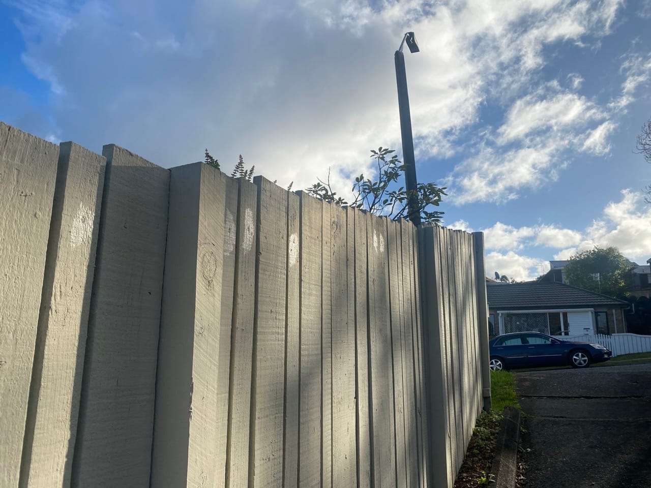
You can see that I was getting a bit frustrated so I just went ahead and painted over all the graffiti anyway. But still want to figure this out, because I want to touch up some other parts of the fence and the house. If I manage to figure out the right color then maybe I'll paint over this section again.
New strategy:
I'll compare the new paint with the old paint and calculate percentage difference for each color channel. Then I'll apply that same percentage difference to the color swatch and look for a swatch that matches the darker color.
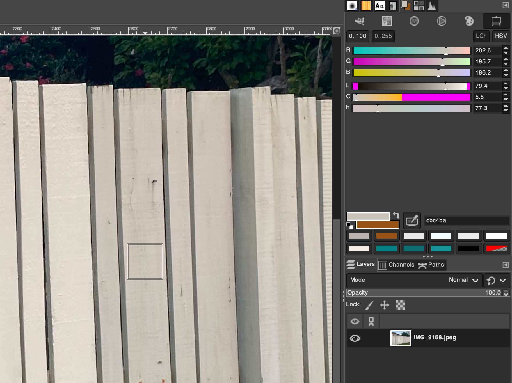
Color difference:
- Red: 202.6 / 221.6 = 0.9142599278
- Green: 195.7 / 215.4 = 0.908542247
- Blue: 186.2 / 204.0 = 0.912745098
So I need to find a paint color that's about 91% as bright as Double Parchment.
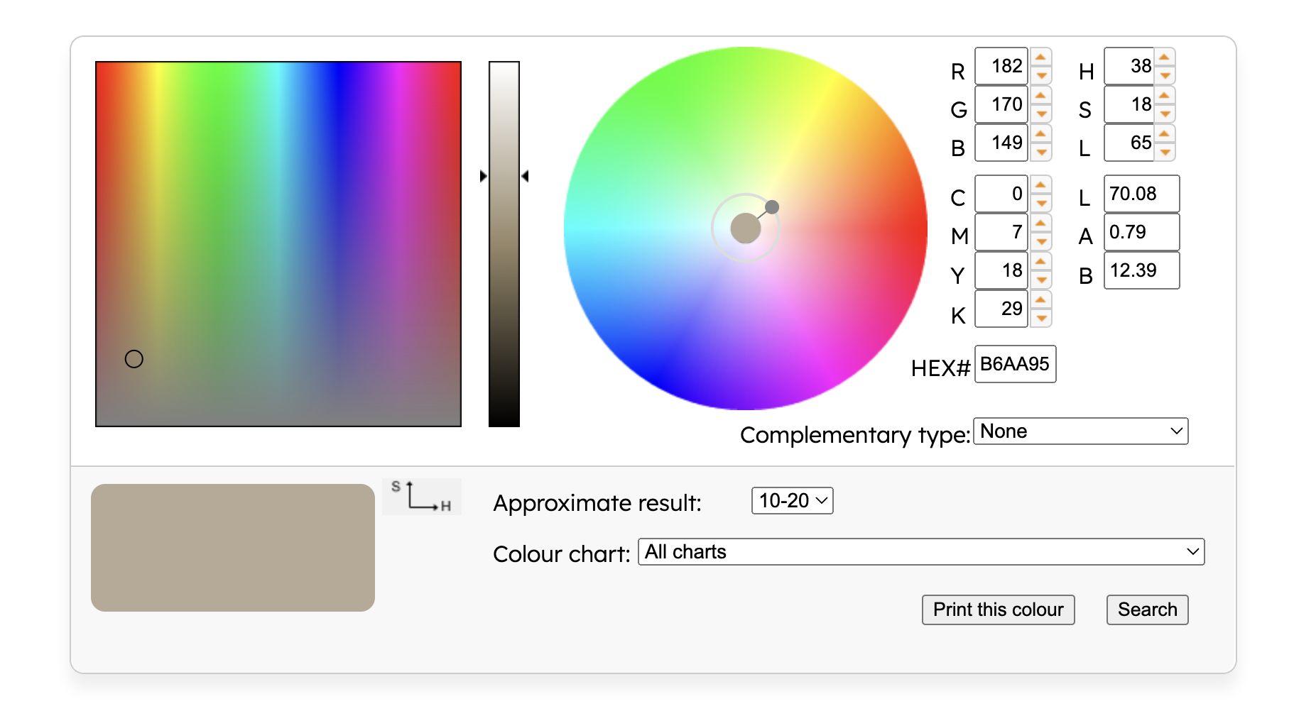
I finally stumbled onto the Resene website, and realized that I had been doing everything wrong up until this point. Using the GIMP color picker for my swatch photos wasn't a very reliable process.
This looks a lot more promising! Now I can rely on some official RGB values for Resene Double Parchment. I just need to multiply them by around 91%, and hopefully this next color will be the right one.
- Red: 199 * 0.9142599278 = 182
- Green: 187 * 0.908542247 = 170
- Blue: 163 * 0.912745098 = 149
They even have a search feature, so you can look for paint colors matching some specific RGB values:
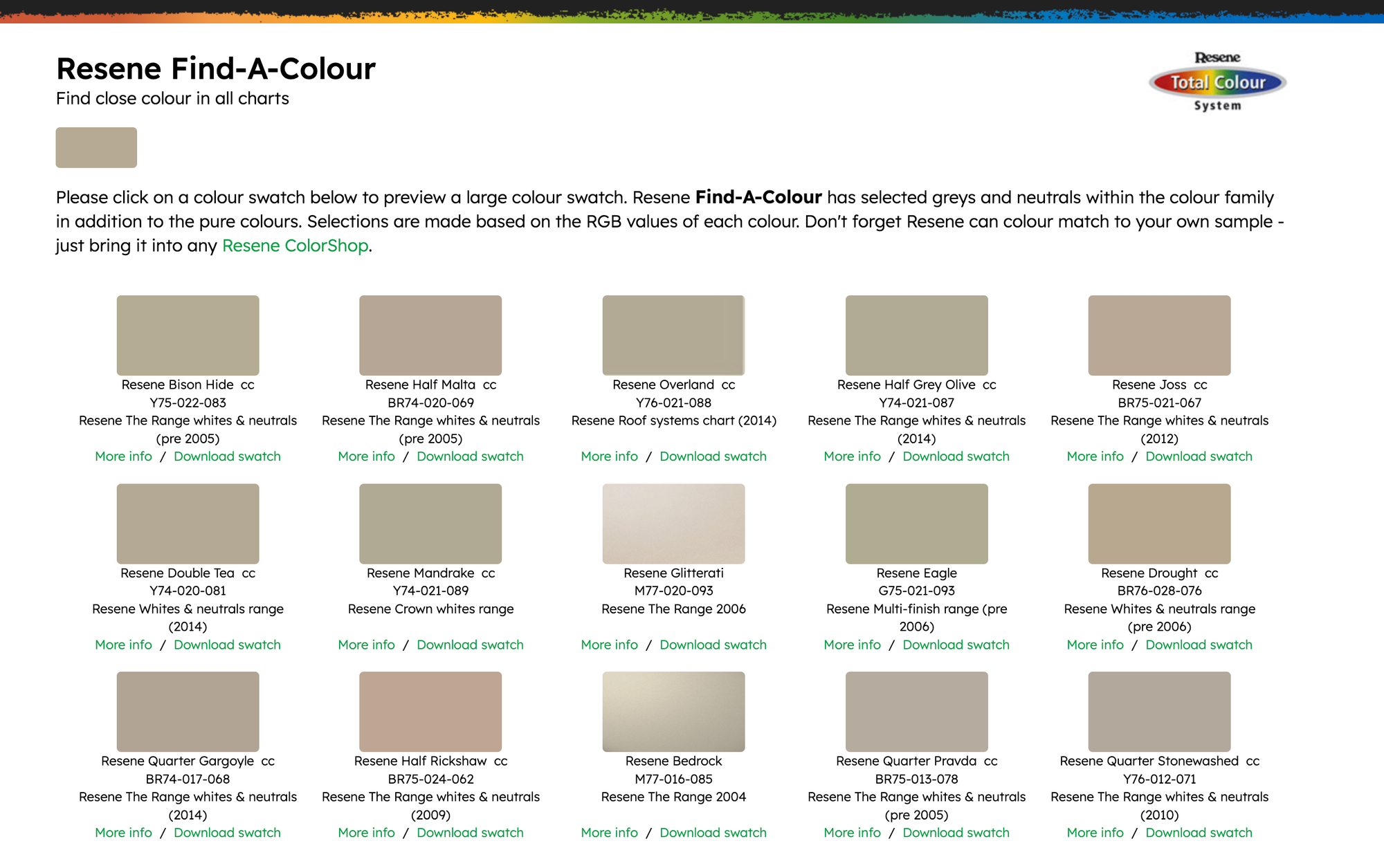
I calculated the Delta-E differences for each color to see which one was the closest. Here are the results:
- Bison Hide: 2.0151 = R:182,G:170,B:149 -> R:181,G:172,B:148
- Half Malta: 2.6672 = R:182,G:170,B:149 -> R:181,G:166,B:149
- Half Grey Olive: 2.4561 = R:182,G:170,B:149 -> R:177,G:171,B:149
- Joss: 2.5412 = R:182,G:170,B:149 -> R:185,G:168,B:150
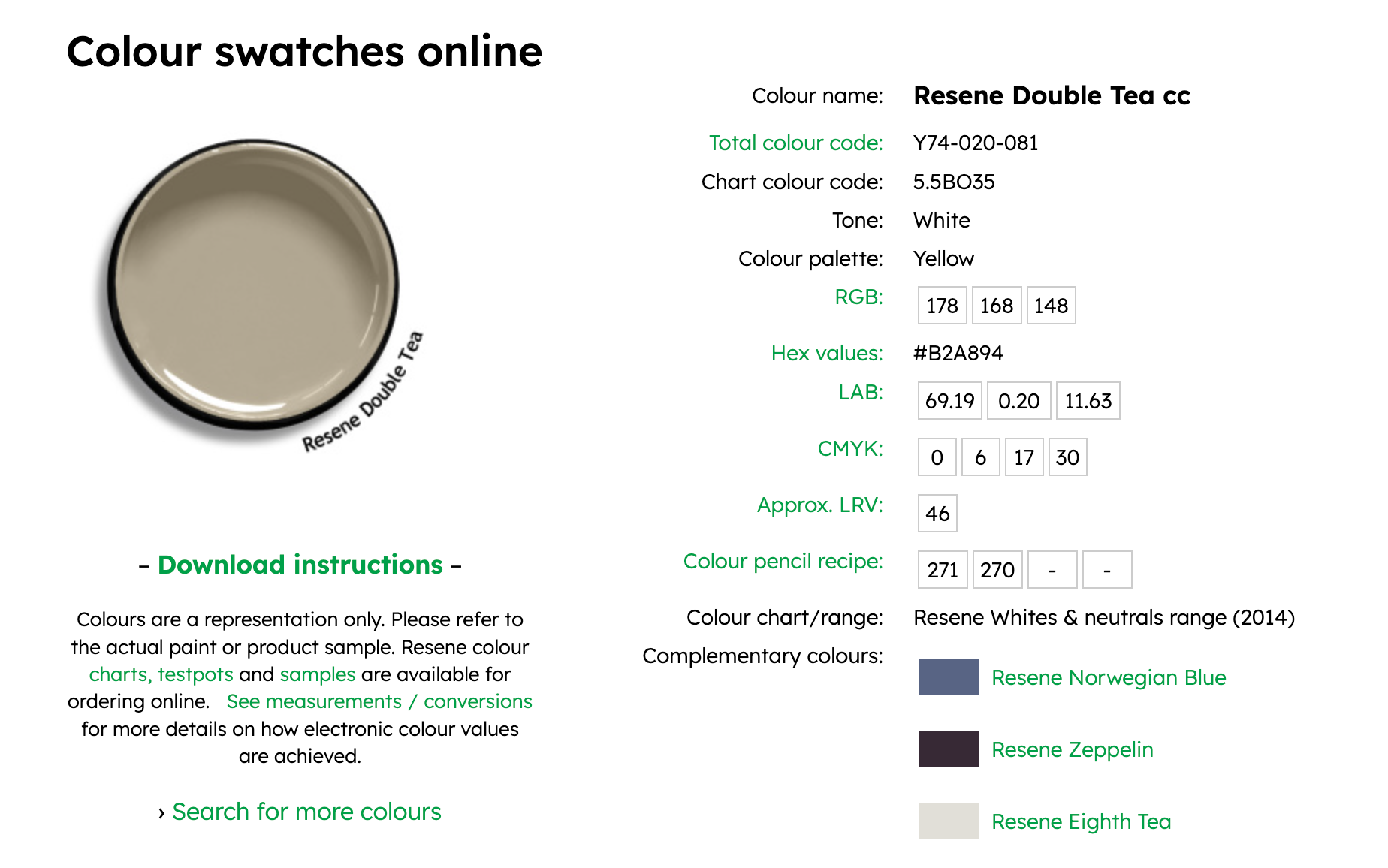
- Double Tea: 1.312 = R:182,G:170,B:149 -> R:178,G:168,B:148
- Mandrake: 2.1529 = R:182,G:170,B:149 -> R:176,G:169,B:148
- Eagle: 3.5444 = R:182,G:170,B:149 -> R:176,G:172,B:148
- Drought: 2.843 = R:182,G:170,B:149 -> R:184,G:168,B:143
- Quarter Gargoyle: 3.795 = R:182,G:170,B:149 -> R:178,G:164,B:149
- Half Rickshaw: 4.1016 = R:182,G:170,B:149 -> R:189,G:167,B:147
- Quarter Pravda: 4.5576 = R:182,G:170,B:149 -> R:180,G:171,B:158
- Quarter Stonewashed: 5.0726 = R:182,G:170,B:149 -> R:178,G:169,B:157
"Double Tea" was the closest match with a difference of only 1.312.
So maybe I'll go back to the hardware store tomorrow and buy another test pot.
The Next Day:
I went outside to look at the fence again. The paint had dried. Turns out that "Double Parchment" was pretty close after all.

There's still some room for improvement, but I don't think it will be noticeable after I paint the rest of the boards in this section. The posts spaced every ~2 metres will help to hide the color difference, especially when the sun is hitting them and casting shadows.
Lessons Learned
- Don't trust your eyes.
- It's very easy to get fooled by optical illusions. Your eyes can be tricked by all sorts of things, including shadows, patterns, textures, perspective, background color, color temperature, etc. Don't use your eyes to compare two colors. Use a color picker tool and check the Delta-E difference.
- Be patient.
- Wait for paint to dry before you make any decisions. Sometimes paint gets lighter after it dries. Sometimes it gets darker. Maybe some paint even stays the same color.
- Don't be lazy.
- I should have washed the fence first. The color of the old paint will probably change if I ever clean it. (Maybe I'll get lucky and it will match the new paint.)
Things I might try next time
If I ever need to color match some paint in the future, I might try using one of these ColorChecker charts:
Contributors to Wikimedia projects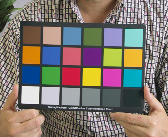
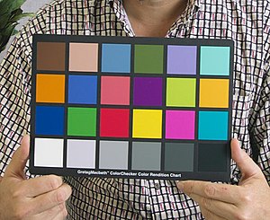

Maybe I can hold this card against the wall and take a photo. Then I can use the chart to calibrate the photo and get a reliable RGB color for the wall. I could also hold up a ColorChecker chart against some Resene color swatch cards, and then calibrate them against the official RGB values from the Resene website.
Update:
I pressure washed the fence and painted a few more spots. I tried taking a timelapse video, but the sun is too bright and you can't really see any difference. Oh well.
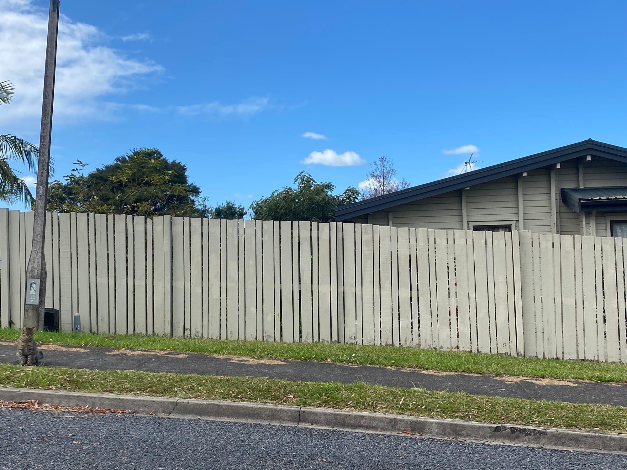
It's close, but not really!
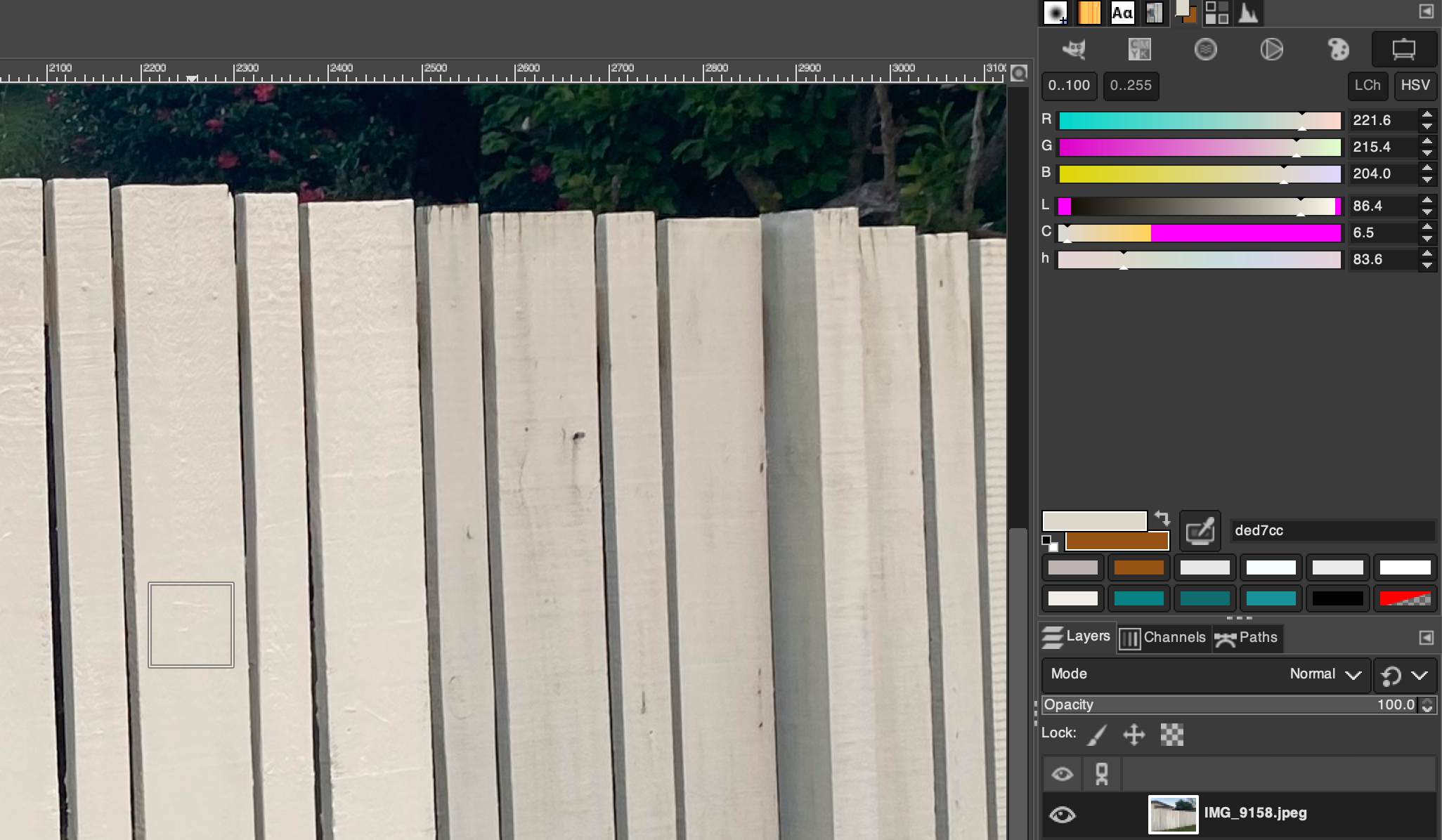
I used the color picker on this photo:
- New paint:
rgb(193.8, 195.8, 181.8) - Old paint:
rgb(181.4, 183.4, 171.4)
Differences:
- Red: 181.4 / 193.8 = 0.9360165119
- Green: 183.4 / 195.8 = 0.9366700715
- Blue: 171.4 / 181.8 = 0.9427942794
I took the official RGB values for Resene Double Parchment from the website, and multipled the values by this ratio to find a slightly darker color.
- Red: 199 * 0.9360165119 = 186.2672858681 (186)
- Green: 187 * 0.9366700715 = 175.1573033705 (175)
- Blue: 163 * 0.9427942794 = 153.6754675422 (154)
Then I searched for this new color: rgb(186, 175, 154)
- Akaroa: 1.9844 = R:186,G:175,B:154 -> R:190,G:178,B:154
- Half Hillary: 3.8147 = R:186,G:175,B:154 -> R:185,G:179,B:152
- Triple Parchment: 2.5177 = R:186,G:175,B:154 -> R:189,G:175,B:150
- Half Nomad: 3.4854 = R:186,G:175,B:154 -> R:183,G:175,B:160
- Silk: 4.9492 = R:186,G:175,B:154 -> R:187,G:173,B:161
- Half Napa: 3.747 = R:186,G:175,B:154 -> R:180,G:173,B:158
- Joss: 3.4876 = R:186,G:175,B:154 -> R:185,G:168,B:150
- Serene: 4.4225 = R:186,G:175,B:154 -> R:189,G:176,B:163
- Antidote: 3.2984 = R:186,G:175,B:154 -> R:193,G:176,B:159
- Coral: 4.857 = R:186,G:175,B:154 -> R:192,G:176,B:147
- Eighth Stonewall: 4.1965 = R:186,G:175,B:154 -> R:178,G:173,B:158
- Quarter Pravda: 4.6182 = R:186,G:175,B:154 -> R:180,G:171,B:158
- Bison Hide: 2.251 = R:186,G:175,B:154 -> R:181,G:172,B:148
Akaroa looked promising. I picked up a test pot and tried covering up a few more rusty nails.
The color was perfect! I couldn't see any difference.
... as long as I didn't look at it from the side.
I forgotten to consider the "sheen", or high shiny the paint is.

Resene paints come in a few different gloss levels:
- Gloss
- Semi-gloss
- Satin
- Low sheen
- Flat (or matt)
The test pot I tried was "made using Resene Lumbersider low sheen exterior and interior paint." It turns out that I needed a flat / matt paint with zero sheen.
I did some more research and saw that Resene has a "Lumbersider Matt" paint. I couldn't find any matt test pots for sale online, and it looks like Lumbersider Matt might not even be available in New Zealand. But I will go back to the Resene store on Monday and ask them about it.
Otherwise, I might need to start over with a different paint brand. Maybe Dulux or Wattyl.